
Howdy folks,
I'm currently in the prepress process for the Lupinity Wolves 2014 calendar. There's good and bad news, like always.
The good news: I finally got the ok from Wildtierpark Edersee to use the photos taken at the park, so I can use the whole range of photos in the voting.
The bad news: I need to swap out some of the photos because the range of colors does not really match the CMYK color range and with some photos, that means I simply can't print them.
One extreme example is Black and Green, the voting winner for May:

Wonderful greens, but only in RGB. Take a look at the before and after comparison between RGB and CMYK in my sta.sh: sta.sh/010fgcn3qehr
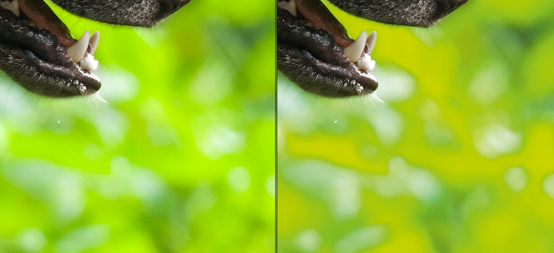
Doesn't really look nice anymore, does it? Yes, I could shift colors some to match the CMYK range, but then it's not green anymore, but yellow. It's not an option, really.
The reason for all that is that the CMYK color range is much narrower than RGB, this diagram shows that pretty well:

As you can see, the really bright and saturated greens are cut off... bad luck!
Now fortunately there are enough runner-ups to cover the loss of photos, and most of the other photos are not affected anyways.
Basically, all photos with a lot of green in it are affected - the March winner (the leap-wolf) is affected too, but while it does look more yellowish printed than the original does and it loses some detail, it still looks alright.
Since I strive for the highest possible quality, please don't be disappointed if Black and Green is not going to be part of the calendar... you wouldn't like the way it looks printed, believe me
UPDATE: Persistence pays off
Alright then - Black and Green is back in the race I suppose. I managed to achieve a pretty good approximation of the greens in CMYK color range. Well, let's make this a tutorial then
First of all - one precious gem in Photoshop I wasn't totally aware of is hidden in View -> Proof Colors. This totally saves my day.
This option lets you work in RGB mode while viewing the output in real time in the selected color scheme, in my case the CMYK color scheme of the offset print machine this is going to run on.
If you just convert the photo into CMYK, information is lost - and you cannot get it back by fiddling with the colors. In the preview mode, you can!
I used hue/saturation to get the details in the cut-off yellowish-green areas back (mainly by decreasing saturation), but that made the photo appear rather dull. What really saved it for me was Shadows/Highlights, as it balanced the levels out just perfectly and brought back a variety of greens I tought weren't possible in CMYK.
No, it's not the same greens - but I'm just about to say it works for me!
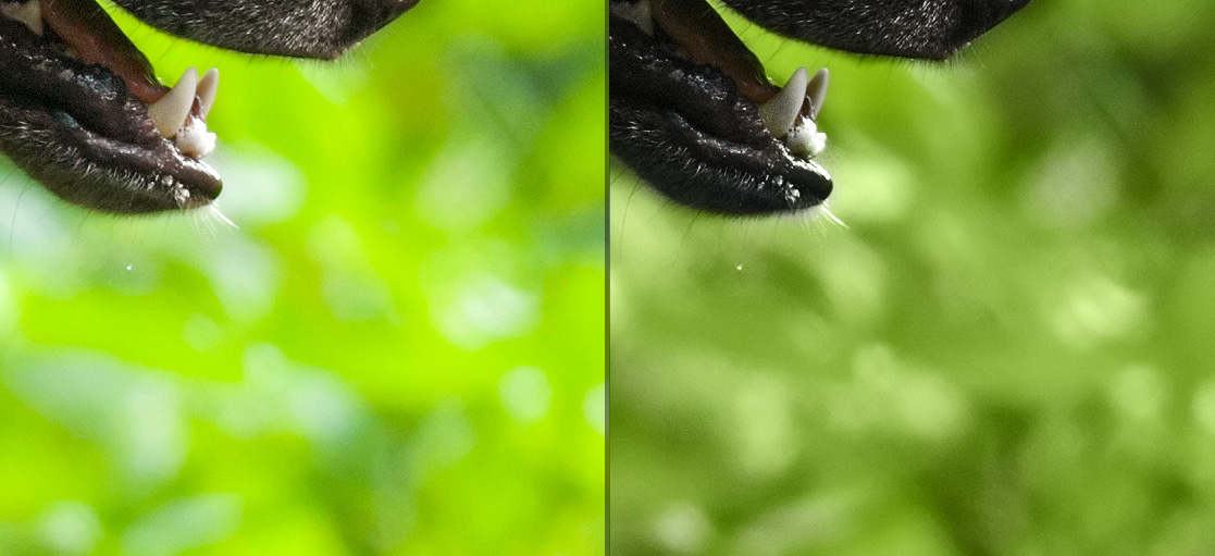
Yes, it does look less vibrant in CMYK, but the overall contrast and impression of the photo is rather nice the way it is now.
It has a slightly darker mood to it - it's pretty much like sunshine vs. overcast skies - but I still like it
So I'm asking you: should I stick with the Black and Green one or replace it with a different photo?
